Typography - (Stick) Alphabet
What is Typography?
Typography is one of many special Ways through which designers and Artists can illustrate and communicate through their Work. It is the Art and the Technique of arranging Letters and Texts in Ways which make such appear in Artistic or unique Patterns, Shapes and Sizes, which contribute to the finished Product consisting of a readable and appealing Overview. Physical and digital Typography can be made through using a large Range of Visual Effects, Colours and Appearance Choices, which as a result can trigger certain Message conveying Emotions for the Viewer. Therefore, certain Elements within a Typography Artwork can play vital roles, as different Design choices can trigger different emotions and if the right design choices are not chosen, then the artist might have failed getting his or her message across.
In Summary;
"Typography is what brings the Text to Life, as it can interact in different
Ways with its Environment and with its Viewer."
Christopher Wool

|

|

|
An Example of a famous Typography Artist is Christopher Wool, who is an American Typography Artist, living in New York and who is known for using a wide Range of Techniques and Styles in his Works. He is best known for in the Typography World for his striking, large-scale paintings of black-stencilled Type on white Canvas Backgrounds. These are often large Pieces with the words abbreviated, disrupted and in grid format, making it slightly more difficult for the viewer to perceive and make sense of the piece.
An Example of such, would be the one on the Side, saying: “The harder you look the harder look. “ This is one of wool’s many short and simple statements embodied into Typography, which all differ in Levels of deeper Meaning. Such like these belong to Wools most iconic Paintings as they are instantly recognisable and highly Popular.
On Reason for that might be because of Wool’s Choice of Colour when it came to how he wants the Eye to directly View his Work. In this Case, the Black coloured Capitals are a direct eyecatcher, but only because of the White and bright Background. Within the white Background, the Artist has also decided to place some more Letters, which are lesser Visible, as they have been Coloured with an Analogues White Tone, making them palely blend in with the White Backgrounds, which is chameleon like. The Artist has tried to through some animalistic Imagery into the Mix, to shake things up. Or he is trying to build upon the Viewers Creativity, making this a free interpretable piece of Art.
This is because of the Imagery and Word play within the Writing, suggesting that the Harder you Look, the Harder you look...at the hidden writing pf the White background. This is clever, because Wool has unironically injected some strong imagery into the Artwork, to expand on its interpretations a first view Opinions.Wool might have also chosen to do this to add a bit more for the Viewer to visually enjoy about all aspects of this Artwork including the at first pale and uninteresting appearing white Background.
The Artist has also created an exclusive Alphabet with all Letters and Numbers. This is good, because it allows Wool to increasingly create more various Typography Words and Phrases while still being able to keep the same style to them. The Letters themselves also have like little lines and detachments to them which again empowers the Uniqueness Factor of this Alphabetical Creation, keeping it Original and still Simple, which is not only good for Wool’s Reputation but also for Viewers, due to their “lined” Uniqueness not making them to basic or boring to look at.
My Favourite Image - BIRTH OF COOL
|
My favourite Piece by Christopher Wool is "Birth of the Cool". Wool has used a Font Type here which is different to the one he usually uses for most of his Artworks.
The main Reason why he uses such on his Black and White Coloured Artworks is to make each Letter and Word stand out and to add an amount of Uniqueness into a "dull Mirror" of Black and White. However because of disregarding that for a Change, he has made this Artwork stand out as the simplicity of the Block Letters a perfect contrast to the vibrant pink are. There are even some purple spots to make the pink stand out from an ordinary appearance. I like that because his message here birth of cool, reflects the colours in the background; a vibrant and purplish pink on top of generic black and white, The Birth of cool overshadowing the simplicity of this world. Pink itself relates to love or femininity, however purple can signify royalty, power, luxury, creativity or wealth. These themes can strongly relate to the Younger generation of the today, as most young people always strive forward in different ways to become wealthy and boost in their creativity. With this Information in Mind, I would like to believe that wools secret message behind this artwork is that the younger generation of today will rise up someday and express their potentials and creativity which will wash out all the dullness in the world. I like this because from this artwork, the viewer can conclude to a largen number of different meaning. For example due to the letters and graphical images covered by the pink, you could even say that wools intention here was to say that following instructions and going by the plan is not the right way of living. Creativity is the right way of living today through rh birth of those right ways of living, the birth of cool. It is a great piece of typography, which Christopher wool has carefully yet uniquely constructed and which I’m sure I can see myself later on for future work. |

|
wemakewords

|
Another Example of a Typography Artists is wemakewords, who are a Design dou, who create typography Artworks through the Usage of natural and household Objects. In the Image below, they have used a minor Range of Wood Sticks and has assembled them so that they form Alphabetical Elements, which in Conjunction form a Word, in this case the Name Violet. This is good, because it helps the Artist to form a more visually appealing aesthetic to the Artwork, which might not have been possible if every stick would look precisely and unnaturally the same. In Addition to that, the Artist has also made sure to use a visually appealing Background for the Letters in the Form of Grass. This is clever because of the Nature like Imagery which might or might have not been intentionally created by the Artists. The Artist might try to visually communicate to the Viewer and display his or her passion or love for nature as we know it. Or perhaps with nature elements engrave into the ground the name of the gardens owner whos name might be violet and through this display her passion for nature. Wemakewords have also used a pooped Football to create and illustrate the Letter 'O' in between 'I' and 'L'.
Reagrdless of the faft if the ball has either been found elsewhere or intentionally bouhg tnad flattened by the user, the red coloured ball creates a strong contrast between the red of itself and the green of the cgrass which are both complementary colours |
My Favourite Image - DREAM
|
My favourite Piece by wemakewords is "Dream". The Piece itself follows a rather simpler way of Layout and Structure due the blank Sheet and the high Number of Daisies only being in use. The Artists have collected a Number of such to form them into individual Letters which will then form together the Word "Dream". I like this, because of the simplicity within this Piece. Taking a Number of a Simple Natural Object and using it in such manner reminds me slightly of child like behaviour. Due to the spelled out word here, i assume that the Artist are saying that Dreams are natural, must like daisies which grow in nature. Yet they and nature itself can mean something different to different people. To some it might mean Prosperity, Power, Peace or in this case Dreams. Perhaps the Artists themselves found their dreams through nature.
As previously mentioned, the Artists have decided to use a fairly simple background for a fairly simple Artwork. However, the dark green of the Daisies stems would be considered a to be a tertiary colour, which perfectly contrasts with the white background. It makes them look vibrant in appearance; stand out, unique, stand out, maybe even a bit to good to be true, just like Dreams themselves. The Yellow disk florets however, are barely visible, meaning that's the initial contrasts remains without any yellow interfering. I really like that, due to how carefully and joyfully this has been crafted together. I like the way of how bend and curvy the Letters are, just like dreams having twists and turns with different types of beginnings and endings. |

|
Mary Jo Hoffman

|

|

|
Mary Jo Hoffman is a Typographist, who specialises her work on natural styles, which in return create a sense of deeper imagery. She uses natural material for her work, including: twigs, leaves, berries, feathers, herbs and many more. Through these, she has also created her own stick Alphabet, which has similarities to a pristine white Background and Shadows, which suggests that if she didn't primarily create this Template digital, then she might have also used some artificial lighting to get the visuality that she wants. The letters themselves however are reduced to straight lines, which simplifies the Alphabet to very geometric Forms.
This is good, because of the still remained simplicity within each letter:
"The simpler the look, the simpler it is to physically recreate."
The alphabets appearance has as a whole has quite a distorted manner to it, empowering the whole theme of nature that Hoffmann went with. This makes the work feel very realistic and real, since that is what nature is after all; distorted and not in order. Due to the material being natural however, it isn't long lasting and therefore will decay and wither away. She also used a plain white background for the Explore artwork, which helps to make the sticks stand out and the word clear to read. Slight shade is also visible underneath some of the letters, giving it an even more realistic effect.
My Favourite Image - "T" for Thyme

|
"T for Thyme" is my favourite Image of Mary Jo Hoffman, which is due to the Correlation between the Letter, the Name and the Material used for this Letter. She has only used sticks and small Leaf twigs to construct the Letter. Each and every Twig looks the same but has either been used or has been slightly bend in order to make every each of them as unique and outstanding as possible. T is the first letter for Tree, Twig and for Thyme. The obvious Theme Hoffman went for with this Letter is Nature, which she has successfully achieved through continues Imagery of Nature and Leaves, which is also embodied through the brown, maroon and dark green colour scheme of the Artwork. It also gives the Letter a certain Theme of Jungle life due to the more inconsistent way through which the twigs stand out. Its almost like as if the Artwork is meant to represent lianas in Jungles , hanging regularly but still having a large Number of inconsistent and bend ones within them. I really like how this Artwork by itself such a long Road of Imagery has and how these can be interpreted in different ways. On of these Ways however could be thinking about pf the natural "T" might relate to Trees themselves. The natural Material Hoffman has used here will eventually decay and has to be thrown away, just like how Nature and Trees themselves can be get drastically damaged if not taken care of. She might have chosen o use such Imagery to create Awareness of how important it is to take care of Nature and its resources. This is a very clever Type of Imagery and a good Way for the Artist to communicate with the Viewer. |
Trip to Alexandra Park (Stick Typography)
(13.09.21)
Our Class went out on a Trip to a nearby Park and had to use Elements within our Environment to form our names, letters ( Name initials) and other inspirational words to show off our understanding of Typography that we have gained so far. I have been inspired by my previous artist wemakewords, due to how good and well they use the background to either compliment or contrast to the object in the foreground. I have tried to do the same in most of my responses, as I really enjoyed playing with different angles and camera shots.
As already previously mentioned, wemakewords use natural and household Objects to create Typography Artworks.
An Example of that is the Artwork of theirs which i have already analysed at the Upper Section Part.
In my Case, I have primarily used the Letters "M" and "A" also in relation to genuine Stick Typography. However, I have also decided to be a bit more open for Variations and have therefore also investigated tree and Leaves which might have some hidden letters engraved into them. I have done this in order to collect as many Letter Variations as possible.
In that double Lesson, our teacher has given us several Advice to enhance the Quality of our Pictures. One of them was to use different Types of Backgrounds, which was important, because such work as Compliments to the Object(s) in the Foreground and to the Artwork as a whole.
The same strategy is visible in the "Violet" artwork of wemakewords, in which they used the red ball to compliment to the green grass, making it stand out very vibrantly and obvious to the Viewer.
Therefore in order to build up from there, I have used a variety of Apps and digital software to enhance the Visuality of the foreground Artwork, which however isn’t necessarily the Case with each and every one of them as the range of enhancements might vary from one letter to the other.
My Work
Leaf / Stick Letters:


|

|


|
Branch / Tree Letters:

|

|
Tree (Sky) Outlines:

|


|
My Favourite Image

|
This is my favourite Image, as it is quite personal to me. For the Leaves, I was actually targeting to form my full name. However, I like this the most, as it is the first Letter of my first name. I did this gathering a bunch of leaves and then shifting them into straight positions. What I like here the most are the large number of Leaves which are visible in the background/on the ground. They add a sense of Life and realism to the "M" and makes this Image overall a lot more interesting to look at.
|
Class Contact Sheet

|

|
A Contact Sheet is an online Image Gallery, that only consists of the best Images from Someone's photo Shoot. It is a simple effective way, to display and present work, for project, review and shortlisting purposes. Contact sheets save time and create organisation. This contact sheet shows the letters created by me and classmates on the Trip, which together formed a full-on Alphabet. We used sticks and other found objects in the environment to create this collaborative and unique alphabet.
To actually make this contact sheet however, we firstly had to select our best images and then save them into a folder with the title; "Y Group".
After that to actually upload it to our Weebly, we had to take a screenshot and then upload it.
An example of how a final product should look like can be seen above on the left side.
Colour Theory

The Colour Wheel is the Circle structure which contains and shows the primary (red, blue, yellow), secondary (green, orange, and purple) and tertiary Colours.
A pure Colour is the Colour with the greatest Saturation in each Hue,
Colour itself has three Qualities: Hue, Chroma, and Value, otherwise known as Hue, Saturation and Lightness:
Hue
- Hue is considered as the Base origin of the Colours we can see.
- Primary and Secondary Colours (e.g. Yellow, Orange, Red, Violet, Blue and Green) are all Hues
- However, tertiary Colours would also be considered Hues , because they themselves are made by mixing two Secondary Colours together which are considered to be hues, turning them into a tertiary and result automatically in a hue as well.
- Essentially = Hues are pure Colours
Tint
- Tint refers to any hue or mixture of pure Colours to which ("a Tint of") White is added.
- A Tinted Colour remains the same Colour, but it will become paler than Its original Standpoint.
- When mixing a Tint, it is important to always begin with the white Paint and gradually mix in small Amounts of Colour
- Essentially = Hue + White
Shade
- Shade is a Hue or a Mixture of pure Colours to which only Black is added
- Therefore unlike a Tone, a Shade doesn't contain any white or grey
- A Shade darkens the colour, but it itself will still remain the same.
- When mixing a shade its important tp begin with the colour itself and than add black and drop
- Essentially = Hue + Black
Tone
- Tone is a Hue or Mixture of pure Colours to which only grey is added, which would be an equal amount of black and an equal amount of white
- Obviously when such is added, then the Grey will make the Intensity much duller
- If mixing with to much Grey into a Hue, then it can become over dulled and seemingly impossible to reverse that Process.
- Essentially = Hue + Grey
Chroma/Saturation
- Chroma is the Quality of a Colour's Purity, intensity or Saturation.
- For example: A grey colour is a neutral : an extreme low chroma.
- Is it essential the Level on how much a Colour through its Characteristics expresses itself which will determine the Measure of its Chroma.
Value/Lightness
- Value directly links into what Tone, Shade and Tint are. This is because, of it more or less being the Lightness or Darkness of a Colour.
- It essentially defines how close a colour is to being either black or white
- However Chroma and Value are independent Characteristics of Colour.
- For example, a Colour with a low Chroma can have a light Value while another low Chroma Colour can have a dark Value.
The Colour Wheel allows Graphic Designers and Individuals who Career consist of choosing and using a wider range of colours to select colour combinations that contrast, compliment or tone with each other, and to select colours that will visually and psychologically appeal to an/their Audience.
Such can create different Colour Combinations which, show the pattern manner of chosen colour dependent on their tone, shade, type, and appearance. Three examples of such are:
- Analogues
- Monochromatic
- and Complementary
The Colour Wheel's Colour Types can be easily identified through visual representations such as the Structure on the here Right. Each of the Three Types have certain Properties and Characteristics attached to them:
Primary
- As already previously mentioned, there are three Colours which belong into the Primary Category or Type within the Colour Wheel: Red, Blue and Yellow.
- These three Colours have a sense of simplicity to them, as they themselves cannot be created when mixing secondary or tertiary colours together, which makes them unique in their own regard and inn return all other Colours dependent on them.
- These Three Colours are quite common to find within our everyday Environment, which is why especially these are very popular with People as well as with Children
Secondary
- The three Secondary Colours are; Purple, Orange and green. This is how to get these Colours through mixing Primary colours together;
- Red + Blue = Purple
- Red + Yellow = Orange
- Blue + Yellow = Green
- The Amount of a Primary Colour you use in achieving a Secondary Colour will determine the final hue of the secondary colour.
- However if white or black gets put into the Mix, the final colour could then also result in slight variations of basic secondary Colours.
Tertiary
- There are six Tertiary Colour in total, as a result of mixtures between Colours, which will lead to the result of a new Colour being made (e.g. a Tertiary Colour)
- A tertiary Colour ( or intermediate Colour ) is made out of a fully Saturated Primary Colour together with a half Saturated Primary Colour.
- These are:
- Red + Orange = Vermillion
- Orange + Yellow = Amber
- Yellow + Green = Chartreuse
- Green + Blue = Teal
- Blue + Purple = Violet
- Purple + Red = Magenta
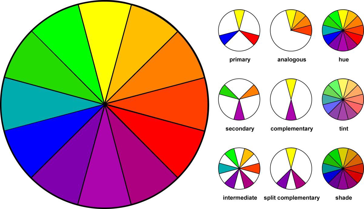
Analogous
|
The Name for Three Colours which are placed directly next to each other within the Colour wheel is called an Analogous, Such a Trilogy usually composes of one dominant Colour (usually a primary or secondary Colour), then of a supporting Colour (a secondary or tertiary Colour), and of a third Colour, that is either a Mix of the first two, or an accent Colour which stands out. Analogous Colours are effective, because they can convey or a create a certain Feeling, as the three of those Colours are quite similar when it comes to their visual Factors such as; their Shade, Hue, genuine Appearance and the exclusive Feeling or scenery characteristic comes with it, etc. If for say shaded together, Analogous Shades can create a very good Harmony between them, through which then a harmonious and comfortable Ambience is present. |
Complementary
|
Colours within the Colour wheel, which are placed right opposite to each other are called Complementary colours. An example of that would be if for say, that the Complementary Colour to Red Green is. These Colours straight up contrast each other and make the opposite colour stand out. Another Example of that is the Colour wheel above which has the Colour Blue with Purplish Tone which strongly contrasts the Strong Orange on the opposite side of the Spectrum. Complementary Colours can effectively be used in Collages or straight up crazy Artistic Artworks, since a big Range of Contrasting and strong colours can be used for a very expressive and inventive Artwork. |

|
Monochromatic

|
Monochromatic Colour Schemes are Colour Schemes based on only one Colour of Tint, This is significant because of the straightforward meaning of monochromatic, which means: "containing or using only one Colour" Within such a Scheme, only one Base Colour is selected and the other Colours are a Variation of that Base. Once the Base Colour is chosen, the Saturation and Brightness of that Base Colour will be chosen in order to create lighter and darker variations through using black and white. The Advantage of using Monochromatic Colour Schemes is that, through their descending or ascending Appearance Structure, that Colour Usage Repetition gets easily prevented. Meaning, that no other shade/tone will look like the other, making each unique and stand out. This is good, because it allows Artists and Designers to create Artworks which in their Appearance have similar looking Characteristics, while simultaneously not being the same at all. |
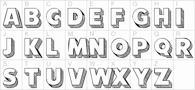
Block Letters Research
"Using Block letters is a very stylistic and Graphical way of communicating through Artworks."
- Michael Albert -

|
|
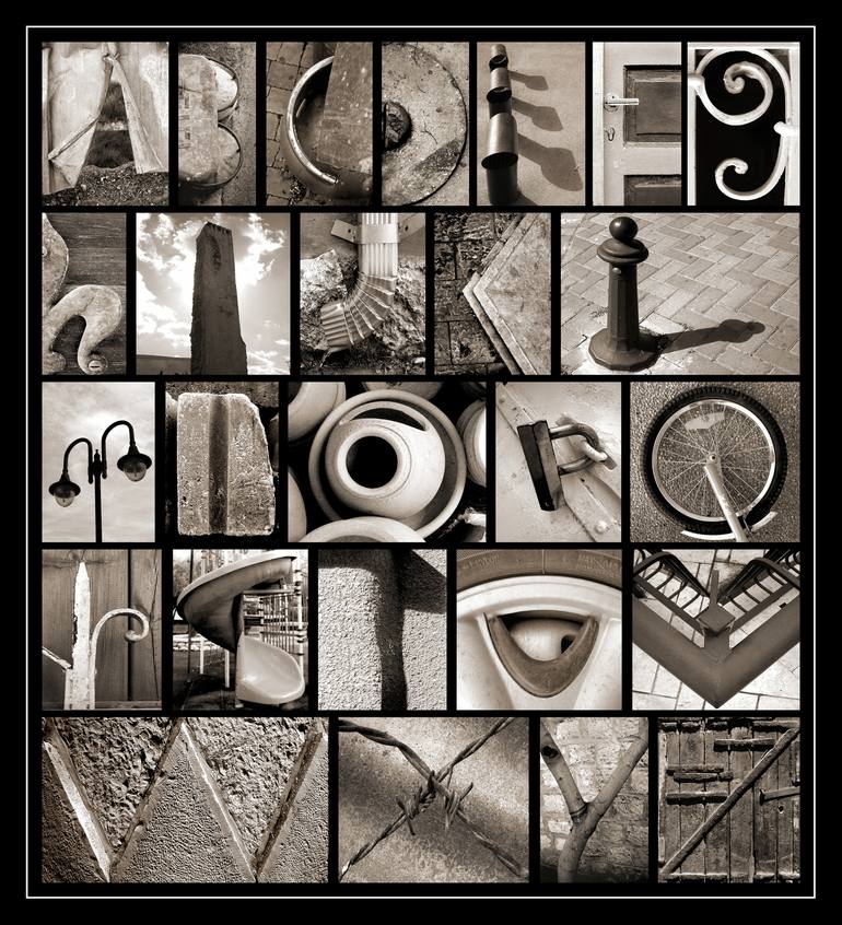
Photo Alphabet Artists
Abba Richman
|

|

|

|
Abba Richman is graphic designer and Photographer, who was born in the UK and who studied at the Bezalel Academy in Jerusalem. Richman's work can be best described as; ever - changing. This is because, of him taking pictures of a large number of different real life objects to form complete Alphabets. Such Objects would include parts of buildings, parts of smaller objects or a combination of different objects. Richman's work has a very neat and concise look to it. I like how he chose to take pictures of all his objects from different angles and positions. This just makes every letter even more unique, due to each looking different from one another as a result of different angles and of their appearances. Abba also uses a black background to make his coloured pictures stand out rather than a white background, to make coloured pictures stand out, which wouldn't be possible with a white background. One more significant thing is that, Richman uses black borders around his final alphabets. Not only does that make the Alphabets look more neat, but it also adds a sense of drama to it, achieved through the thin grey box in it.
Analysis - 1
|
For the first letter, within the image at larger, the Artist has used a nature/garden scenery to display an A, made out of Wooden plates. The Artist has also chosen to, for some leaves and branches to be visible in the small Image and to cover parts of the A. This is smart, because through such Elements, the Artist creates nature and peace like imagery, which she might have chosen to do so, to evoke a sense of peace for the Viewer. The Artist however does not continue this Theme for every other Letter, due to most of them being quite more objectual. This is good, because it prevents repetition and makes each letter unique and different from each other. My favourite letter from this Alphabet is the B. Richman has used Fruit to illustrate the Letter in a unique way. He has done this through cutting One Grapefruit and placing three clementine’s in a line. He also made sure to take the Picture from a high Camera angle, which makes the B look even better. |

|
My Favourite Image - "Q"

|
My favourite photo taken by Abba Richman is this "Q". He has taken a photo of a bicycle wheel on top of a genuine roadside surface. The Wheel itself seems quite new or barely damaged, due to the shine of most metallic parts. The outer rubber circle has more height and thickness to it in comparison to the metallic circle, which is why it reflects the black colour as shadows at some parts of it. This is also visible thanks to the angle at which Richman has taken this picture. It’s at a straight angle from the bird perspective, making the object very neatly "boxed in". He has also chosen to cut off the longer parts of the bike to make it even more identical to the line that goes through the bottom right side of the Letter "Q", giving it more realism. The silver and black grey rocky background quite complement each other thanks to increasing/decreasing brightness.
The Black is the darkest colour in the image, followed by the grey background and then by the silver. I really like the choice the Artist has done towards the colour coordination. |
Bob & Roberta Smith

|

|
Bob and Roberta Smith is an Artist, born in London and who studied at the University of Reading from 1981-1985 and at Goldsmiths College in 1991. He trained as a sign painter in New York and uses text as an art form, creating colourful slogans on banners and placards, that challenge elitism and advocate the importance of creativity in political and educational sectors. He himself is best known for his several Works of art, including;
He also has curatorial projects, including;
- Make Art Not War (1997)
- Letter to Michael Gave (2011)
He also has curatorial projects, including;
- Art U Need: An Outdoor Revolution, which transformed public spaces in the Thames Gateways (2005-2006), and Peace Camp at the Brick Lane Gallery (2006).
Analysis - 1
|
What is it? What exactly can you see? What is happening? What does the work advertise or represent? · What does the artist call the work? · Does the title change the way you see the work? · What is the theme of the work?
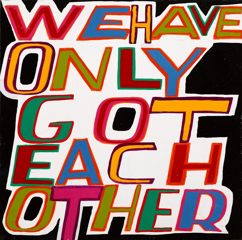
"We have only got each other" is my favourite piece of art form Bob and Roberta Smith. I like it, bcause it essentily is just a collection of Letters, placed on a white background. It looks almost like as if, that the text is slowly being surrounded by the Black. Due to the message, i am assuming that the artist is trying to convey that we as people have to work more together or else we get conumsed by our problmes, which are here personified in through the black border. |
|
Block Letters: my work
Click here to edit.


PRINTING
Click here to edit.
|
|
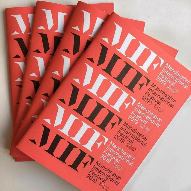
MIF Poster Project
|

|
What is MIF?
- The Manchester International Festival is an Event in which, Artists from different Art Forms and Backgrounds come together to create dynamic, innovative and forward thinking thinking New York, which will be staged in a rich Tapestry of Venues across Greater Manchester; from Theaters, Galleries and Concert halls to railway Depots, Churches and Car Parks.
- MIF is not only about the Music or the Excitement, it is about influencing and working with Communities around Manchester.
- One way through which this is Achieved, is through the "My Festival", which is MIF's creative Community, in which creative People continuously take Part in public Projects, connecting the Festival to their Communities, and joining our Programmes of training Activities, Workshops and other Special Events.
- MIF has now been running for 14 Years, with its launch in 2007 as an artist-led Festival presenting New Works from across the Performing Arts Spectrum, visual Arts and popular Culture.
- MIF is also a registered Charity. Alongside with the Income they receive from Manchester City Council and Arts Council England, their Principle Funder, they also receive Income from Ticket Sales and co-commissioning Partners; from other public Bodies. such as the Association of Greater Manchester Authorities (AGMA); from private sponsorship; form charitable Trusts and Foundations: and from individual Donations. In a Nutshell, they receive a lot of Support in order to make their Visions turn into Reality.
One of the leading worldwide incubators for new, cutting-edge art. Though the festival has an international outlook and reputation, it also showcases Manchester stories and talent.
New York Times, June 2017
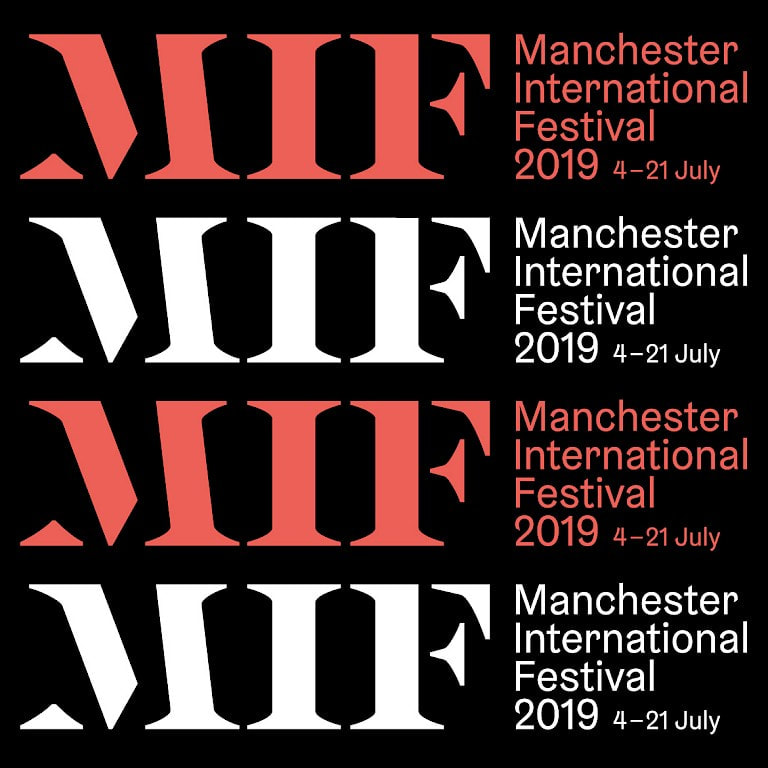
How does MIF link to Typography?

|

|
As previously mentioned, MIF is a very popular and well known Festival in which many Activities take place and a lot of money has to be invested into.
Various Ways through which this is achieved is through Posters, Leaflets, Social Media Platforms (e.g. Instagram Posts, Snapchat Stories etc.) or through their own Event Page, which either might or might not link to Typography Elements.
These past Examples below however do include Typography Elements.

|


|

|
Poster Analysis #1

Designer:
-Simona Puidokaite-
This first Example here has been planned and designed by Simona Puidokaite, who appears to have been implementing certain design choices into her posters to give them a sense of professional and modern simplicity.
The First Poster essentially consist of three geometric Shapes. This is good because not only do they uniquely form together to form a generic rectangle, but they also each have an individual colour or texture to them, which separates them from one another in terms of visual equivalence. Therefore, Puidokaite has cleverly used a unique formation to create a generic overall outlook which gets reflected in the overall appearance of both posters: the colours may be simple and generic, but her layout choice makes them look smart and professional.
It’s almost like as if these were to be the type of magazines/Posters stereotypically found in expensive branding stores. That’s how professional these are in appearance.
The first one consists of a warm orangish, light brownish colour, of a slight pale black and of black and white. The Orangish colour is an obvious stand out here simply because it gives this unique out of nowhere vibe which is much harder to achieve with only black and white. This can be visible through the small black tact and the small miff logo at the top right. The Black really stands out twithought necessarily destroying the overall vibe which is given off by the orange. This be because of the slight black tone which might have been most likely added to the oranges colour to enhance it when contrasting with straight up black.
Something similar has been done at the left for the black and white. The white is lightly engraved into the brighter black without creating a to strong contrast as the simplicity/smartness is still visually available throughout that side and therefore throughout the whole poster.
It is also good how she hasn’t made the main visual attractions to huge which resulted in some space being left at the bottom. I will put this into consideration for my one poster. The second one has letters on it which would’ve been most likely been self-made if not an already available font has been used. Therefore, I will put into consideration if I want to use my own self-made font from frontside or just use a variety of different already available used ones.
Overall this Poster has given me a small range of good and tangible ideas for my own, which just shows how much effort and quality headliner has put in.
I’m aiming for the same.
Poster Analysis #2
|
|
This is first Example here happens to come in the Form of a Medium Sized Magazine, which because of that can has a lot more Information about the Event stored in it, in comparison to a genuine leaflet. Therefore, when considering that content is already higher in its Amount, then you could consider that the Appearance and layout of such will be correlating effectively with the Front Page Typography cover.
This is clever, becasue the Front page cover in this case works as a full
This is clever, becasue the Front page cover in this case works as a full
Design #1
Inspiration:
Ben Burton=

|

|
For my first Design, i have decided to Physically sketch Initial Inspirations to from and create a Geometric like Poster which can end up having a variety of different Interpretations.
- Firstly however, i have decided to draw two identical Rectangles on a Double Page Spread, for Annotations and for a clear and free Outlook of what I do want and don't want to include in the Posters Appearance.
- The Red and Blue are Imagery of Man City and Man United.
- I have done this in order to Create an Imagery of Unity not only within everybody participating the Festival, but especially between fans and long Time hardcore of both Football teams.
- Both Teams successful in their own individual Respect, therefore I wanted to as good as possible to represent both Teams as successful in their own Respect on these two Pages.
Design #2
This here is a self made structure which I'm planning to incorporate into my final poster design, in conjunction with my Physical Design.
It will bea mixture of over and underlapping Objects, which will be visible in different Font Sizes.
It will bea mixture of over and underlapping Objects, which will be visible in different Font Sizes.

|

|

|

|

|

|

|

|
final design;
either that one or with some more alltirations
either that one or with some more alltirations
ILLUSTRATION | Photography
What is Illustration (in Photography)?
Illustration is the Term which refers to the Idea of taking a Photograph or several ones and editing them to turn them into something unique and different.
- Such often gets used in Advertising, Marketing, Book cover art, and even journalism.
- Illustrative Photography makes a large use of genuine effects and Ways of Picture taking when the Camera is being used.
- This can either be in normal or in slight unusual Ways.
- An Example of such would be, using a normal Camera with high definition and resolution and taking a Picture of a either Normal or Abstract Object or Scenery, and then such Pictures in different Ways.
- Such due to their unusual or unique Appearance usually convey some sort of (hidden) Message
- Sometimes it can be difficult for the Artist to full convey the Message towards the Viewer, unless a good and effective Illustration is being used or presented.
- One that has a Level of depth suitable and understandable for the Artists intended Target Audience.
What Artists are involved in Illustration?
Aaron Siskind
|
Siskind was an American Artist and Photographer, who began his Photography in 1932, while being and English Teacher in the New York public-School System.
As a Member of the Photo League, which was a cooperative of New York Photographers who banded together around a Range of common social and creative Causes, he participated in Projects designed to document neighbourhood Life during the Depression within the Project. This is significant, because when looking at some of Siskind's Work, a lot of them have a sense of Emptiness and Tragedy to them, which also has been achieved through the Colours and Contrast Levels used within his work. However. after the late 1930s, Siskind's Career in Illustration Photography took a Hold and converted into a focused Mindset of Architectural Photography, as in his Series Old Houses of Bucks County, and on natural Phenomena and still Life
|

|


“Photography is a way of feeling, of touching, of loving. What you have caught on film is captured forever…it remembers little things, long after you have forgotten everything.” - Aaron Siskind
Aaron Siskind - Analysis 1

Aaron Siskind
Aaron Siskind's work is based on taking pictures of texture and marking seen on walls. He explores different materials and artistic choices against one another and makes the audience pay attention to the smallest of details that we may not even think about in our daily lives. The texture is quite rough, broken and uneven. In this image we see the wall almost breaking down due to age with clear black writing that almost appears to be perfectly printed. This photo is also monochromatic (greyscale) giving the image more depth and we can see the indents and cracks in the wall. I believe that making the image black and white makes it appear grunge-like and dark, an eerie atmosphere can be sense from this due to the roughness of texture and graffiti scattered around the picture. The texture also allows clearer highlights and shadows to be shown, we can see that the pillar like structure in the centre of the wall casts a small shadow to the right of it whilst catching bright highlights on the left side. I believe that this photo was captured by standing really close to the wall so that it captured the small details on the wall, we see this as a close up shot because the black graffiti-like writing is being cut off on the side. If I were to capture a similar image I would stand still with my camera/phone and take an unclose photo of the wall. After that I would edit it using either SnapSeed or Photoshop, changing the photo to grayscale, intensifying some shadows and highlights and finally maybe putting some filters over my work to give it even more texture and extra small details.
Aaron Siskind's work is based on taking pictures of texture and marking seen on walls. He explores different materials and artistic choices against one another and makes the audience pay attention to the smallest of details that we may not even think about in our daily lives. The texture is quite rough, broken and uneven. In this image we see the wall almost breaking down due to age with clear black writing that almost appears to be perfectly printed. This photo is also monochromatic (greyscale) giving the image more depth and we can see the indents and cracks in the wall. I believe that making the image black and white makes it appear grunge-like and dark, an eerie atmosphere can be sense from this due to the roughness of texture and graffiti scattered around the picture. The texture also allows clearer highlights and shadows to be shown, we can see that the pillar like structure in the centre of the wall casts a small shadow to the right of it whilst catching bright highlights on the left side. I believe that this photo was captured by standing really close to the wall so that it captured the small details on the wall, we see this as a close up shot because the black graffiti-like writing is being cut off on the side. If I were to capture a similar image I would stand still with my camera/phone and take an unclose photo of the wall. After that I would edit it using either SnapSeed or Photoshop, changing the photo to grayscale, intensifying some shadows and highlights and finally maybe putting some filters over my work to give it even more texture and extra small details.
An Example of that is the Image below, which...analyse
TYHEYRE WORK IS ALWAYS STRAIGHT TO THE IOBJECT WITHOUT ANY ANGLES
This is what he did for Illustration..
TYHEYRE WORK IS ALWAYS STRAIGHT TO THE IOBJECT WITHOUT ANY ANGLES
This is what he did for Illustration..
Lee Woodgate

|
Lee Woodgate is an Illustrator who is located in Lewes at the south Coast of England. He graduated from the UEA with a (BA) bachelor’s degree in Illustration in 1994. Lee has over 10 Years of Experience working within the Advertising, publishing, and editorial markets. His Work is based on Photos with simple Colour, which have a sense of paleness to them due to the often use of a white background within his Work.
Woodgate is an also represented in the UK by Eye - candy Illustration Agency, Member of the Colour din collective. His Work can be described as; disoriented, cramped together or even as Inconsistent. This because he uses a wider range of Images which all together create a sense of Imagery of a City or of City life. I believe that the Reason for why he cramped his Images together in his collages is to mirror city life as a whole; crowded, busy, ongoing, restless, and always awake. However he also uses many negative spaces within his work, which is the empty space and artist leaves untouched within an artwork, most of the time for a certain reason. We have identified this detail in class, and I’d like to believe that the reason behind his choice is to digitally illustrate the calmness and peace which can be found and obtained at the borders outside of busy urban areas, which might have a deeper meaning towards the artists. Maybe himself was born and raised in more rural areas and then moved to urban areas as he grew up. Either way it is a great way of imagery which the artists consistently uses although out his work. Talk about the Colours |

|
Lee Woodgate - Analysis 1

|
The Artist has used a Variety of Real Life Images in this Collage, regardless of them either bring secondary resources of others or if he took these by himself.
The Collage contains of a large Number of City or Traffic related Objects, which all happen to be quite aggressively yet also complementary and carefully cramped together. However from the looks of it, it appears as if just due to their digital still stand that they wont have to stand still, but instead still continue to go thought heir daily activities and routines. Each and every object has a purpose and has only that Purpose to fulfil. From this Information, I believe that the Work represents busy City life and how crowded and busy it is without standing still and without rest. The Artist has used the Red and Black in this Artwork to contrast the pale White Background. This makes the Thresholder Objects a lot more stand out and in a way even "explosive to the Viewer. This effect has also been achieved through the Negative Space which is visible through the Collage. Its almost as if this is a physical painting rather than a digital collage. There is more red than black in here. I believe that the traffic light have been coloured as black in order to highlight what a traffic light actually is; a symbol of order. without it, traffic would go down into Chaos, therefore the Artist has highlighted this Object to make it standout in this Chaos Collage. |
Illustration
Illustration is the use of digital or physical resources and platforms to create digital or physical visualization according to the artistic vison(s) of an Artist. An Illustration is a drawing (or painting, collage, engraving, photo, etc.) used to explain or display one or multiple Ideas. It is the actual creation of new art with digital tools, as various tools can be used to manipulate the appearance of actual images.
Introduction tasks to Adobe Illustator
APPLE LOGO -
The well-known Apple logo consist of a black Colour fill, of a small leaf at the top and of a small bite, intentionally designed by the Company to make this Logo as easily recognizable, simple and unique as possible.
In order to re-create this logo, I first made sure to create a circle, through the circle shape tool. I then used a triangle from the ellipse and created three engravings for that circle: one at the top, one and the right side and one at the bottom.
I made sure to add more anchor points to the apple, to make sure that it will look as just as the original logo.
I then used the direct selection tool to adjust the lines from each engravement, after which I had to use the smoothing tool to smoothen out the lines of the apple.
After that I had my actual apple. I then used a circle with the pathfinder and cut a circle shaped bite into the apple, making the bite neater and closer to the original. To make the Leaf, I used a circle from the ellipse tool and through the direct selection tool used that shapes anchors to adjust it into the apple leaf shape. After adjusting it into position, I then used the live paint bucked and coloured in both the leaf and the apple black.
I were to improve anything on from the piece, then I would firstly make sure to make the bottom right of my apple a lot spikier and more like the actual logo. I would also most likely do the same to the leaf, due to it looking to circle like and less pointy than it should. However, with more practice, I think that I will be able to make better and precise adjustments to shapes and objects when working with Adobe Illustrator. Nevertheless, re -creating this logo was still quite challenging, due to the use of various techniques and tools.

Mine | Real
|
Mine | Real
|
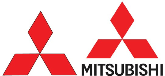
MISTIBUSHI MOTORS LOGO -
The simple yet unique Mitsubishi logo has three read diamond shapes, which point inwards towards to centre. In order to re - create this logo, I used a star from the shape tool and turned it into a triangle, through using the down arrow key, which decreased the number of points until it turned into a triangle. Holding down the shift key has enabled me to recreate a neat and accurate equilateral triangle and to rotate the shape by 45 degrees. I then copy and pasted the triangle, joined 2 together and grouped them to stay together.
After that I used the live paint bucket and the eye drop tool to colour fill the diamond.
Then I copied the final shape and pasted it twice, after which I adjusted the other two copies accurately through rotating them and using the direct selection tool to make it look like the real logo.
If I were to improve anything, I would have removed the black outlines from my logo, due to the real one not having any black outlines. I would have also most likely added the actual name underneath my logo to make it even more accurate.

|
PACMAN GHOSTS (AMAZED AND ANNOYED) - Making these ghosts from Pacman were my starting point of handling the various Tools in Illustrator due to their slight or big differences they have compared to the tools in Photoshop. The Ghosts have straight bodies with slightly curved triangle Patterns at the bottom, eyes and mouths formed through objects from the shape tool and colours used to illustrate their Moods. Yellow for excitement and fanciness and blue for simplicity and emotion . I made sure to put some variation into the mix between the bottoms of my Yellow Ghost and my Blue Ghost, according to the the personalities that I have gave them. |
The Blue one has a quite annoyed or unamused visual expression, which is why I made sure to have its bottom spikes to be a lot more spikier and lesser curved than the ones of my yellow ghost, while the yellow ones spikes a lot more curved are due to the very amazed and fascinating personality I chose to give it.
In the process of making these, I first used a simple ellipse and the rectangle shape and matched them together, after which I put them on top of another. I then used created a white triangle with no outline and took small neat cuts of the bottom of the blue rectangle and then later of the yellow one as well. I then used the Anchor Point tool to make sure that the Spikes of the bottoms of my Ghosts have a specific level Spikiness and style to them. For the Eyes of the blue Ghost, I used generic circles through the shape tool again and used the pathfinder to create this cartoonish like look to them. I wanted to create almost half cut inner black eyes layered on top of normal white circles, which are again placed on blue circles to compliment the Ghosts colour as a whole. I then created another black circle and cropped it through the use of the cropping tool to turn them into semi circles. After I placed them all together, the Ghost got an expression which has a lot of personality to it. I collectively did the same thing for the yellow Ghost, however only with tringles and one normal Circle from the shape tool.
I created the star by pressing down ctrl + the arrow up key adding the number if spikes to the Shape. Therefore for the inner triangles I didn't increase the number of spikes but used the eye drop tool and coloured them black for the eye pupils. For the mouth I just used a generic Circle, enlarged however through selecting it and increasing its size at its end points.
As a whole, I'm quite happy with the way these came out, however if i were to improve something about these, then I would make sure add a bit more expressional detail to the yellow ghost, in terms of experimenting a bit more with the pathfinder when it comes to the eyes or adding more detail such as lips or a teeth for the mouth.

|

|
PACMAN (EXPRESSIONS = NEUTRAL, HAPPY, ANGRY, ANNOYED) -
Recreating Pacman on Adobe Illustrator was quite an easy task. Pacman only consists of two circular shapes, black outlining, a square shaped mouth and black eyes. To recreate this, I first used the ellipse tool to make a perfect circle by holding down shift. After that, I then created a square and took a cut out of the Circle to create the open mouth. Then I used the live paint bucket and the eye drop tool to colour the shape yellow. Lastly, I created another smaller circle and colour filled it in Black for the eye.
However, I also made a few variations after the the actual one was done.
This is because, I wanted to put in a bit of variation and try out some techniques which would determine the expressions of my Pacman.
For the eye I have copied and pasted the actual circular eye from my first Pacman and then cut half of the circle off to create a semi - circle. I then also created a small line though the ellipse tool and put tilted it at an Angle to mimic an eyebrow.
I repeated this a few more times, while also turning the eye at an angle of 180 degrees and changing the direction of the eyebrow as well to have multiple finished versions for my Pacman.
KEYHOLE (FILL & NO FILL) -
Keyhole-
The Keyhole has a unique shape, I used a triangle and a circle to recreate this shape. To get a triangle I used the star tool and pressed down on the arrow key which decreased the number of points making it into a triangle. I filled the triangle in black and made a circle using the ellipse tool, filling it in black and putting it on top of the triangle. This created the simple keyhole design.
The Keyhole has a quite simple yet effective shape, which I have recreated through using only two shapes: a circle and a triangle. I firstly selected a star through the star tool and used both shift and the arrow down key to decrease the number of points of the triangle to three. I then made a circle through using the circle shape tool. I adjusted the width and height of both shapes through using the direct selection tool and then placed the circle above the triangle, while still letting the top of the triangle overlap with the circle. I then used the pathfinder to combine both shapes togther and then made the same again through grouping them. Finally, I then used the live paint bucket and the eye drop tool to colour fill in the hape black and gie it a vlack out line. I also made sure to ma
Malika Favre
Click here to edit.
Introduction
Click here to edit.
Image Analysis 1 -
|
Click here to edit.
|
Image Analysis 2 -
|
Click here to edit.
|
Image Analysis 3 -
|
Click here to edit.
|
Further Analysis on Malika Favre (Videos)
Personal thoughts notes -
Click here to edit.
Illustration Analysis - Malika Favre

THE NEW YORKER - MALIKA FAVRE
Use different image
Click here to edit.
Self - portrait (Malika Favre) -
My Photo (Me)
|
My reference (Malika Favre)
|
Click here to edit.
Completed response

|
|

|
Click here to edit.
Fruit editing
Olivier Klugler
"Olivier Kugler is a German reportage illustrator based in London. After his studies in graphic design in Pforzheim and working as a designer in Karlsruhe, he did his masters in Illustration at the School of Visual Arts in New York."
"In 2011, he became the overall winner of the V&A Illustration Awards for his journal depicting a truck driver's journey across Iran."
"In June 2018, he won the Jury Prize of the European Design Awards and in November 2018, he won Prix du Carnet de Voyage International and the Coup de Coeur Médecins Sans Frontières at the Rendez-vous du Carnet de Voyage."

|

|

|
In addition to portraits, maps, and food illustrations, Kugler has done extensive reporting and graphic illustration covering the experiences of Syrian refugees he met in Iraqi Kurdistan, Greece, France, Germany, Switzerland and England, mostly on assignment for Médecins Sans Frontières. Through many Interviews, and hundreds of reference photos, Kugler's drawings beautifully observed drawings of his interviewees which bring to life their location - a room, a camp, on the road. His reporting of their stories is peppered with snatches of conservation and images of the objects that have become such significant part of their Lives. Olivier Kluger's inspirations come from looking at sketchbooks of artists/illustrators such as Adolf Menzel and Alan E Cob
Put simply, it is a book of powerful, educational words and inspirational illustrations. Each illustration on every page is remarkable, because Olivier manages to capture the ‘soul’ of everyone he meets and draws.
- Kevin Milsom, Joyzine -
Analysis 1 -
What is it? What exactly can you see? What is happening? What does the work advertise or represent?
It reminds me of Lucinda rogers art
What is it? What exactly can you see? What is happening? What does the work advertise or represent?
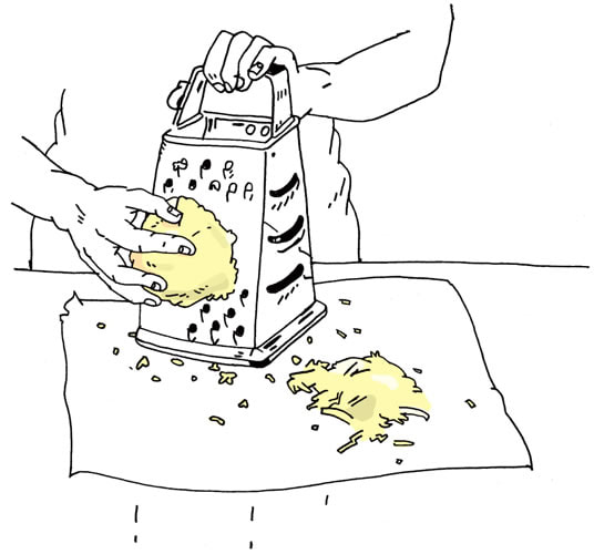
Olivier Kluger's work has a very digitally hand drawn and cartoonish style to it. His style is isn't perfectly neat, but a lot more realistic, due to its sketch like appearance. It almost looks like a physical free - hand drawing, which really reminds me of Lucinda Rogers's or Liz Steele's Work. Similar to their work, he primarily uses Black for his Artworks, but also includes different bright and vibrant colours, which add a lot more realism to his Artworks. Kugler focuses his work on variety of different food types, which is why he here uses Cheese for variation. This links to our current work, as we also used Cheese for our Cheeseburger Illustrations. The Artist works in a studio, in which he uses a pencil to draw his work before going over with a fine liner and then scans them in to place them neatly together in a layout that will look similar to its real life counter part.
This Artwork shows a person with an apron grinding a block of cheese. The Artist made sure to draw a line in the middle to show that the platform for the grinded cheese is on a table.
. In this piece of work we see that Olivier Kugler has illustrated “Olive Oil”, featuring someone pouring oil into a hot pan of vegetables. I believe Olivier Kugler has created this piece by taking a photo himself of someone cooking before beginning to draw using pencil and fine liner. His studio is set up neatly and has natural light which helps him to draw and maintain a cleaner illustration. The illustration appears like a sketch and has very clear and clean lines throughout the work which shows the artists confidence. The flames under the pan has been coloured in a simple blue colour to represent the heat. Only a few cut vegetables have a lineout, the rest is an arrangement of colour that was added digitally. This makes the pan appear more full but also add in some easy detail which shows the viewer how the vegetables are cut (into small cubes). The main subject is the pan as the person holding it is cut out of the frame, we can see that Oliver Kugler wants to focus on food.
The colour scheme used in this piece of work is a combination of green, red, yellow and blue. These colours are used throughout his work to advertise healthy eating and other recipes containing vegetables. This adds more life and colour to his work, the colour adds warmth making it appear appealing to the viewer. This is very important when looking at food, as it is important that the colour draws in the audience. Without the use of colour the work would appear unfinished and plain.
It reminds me of Lucinda rogers art
What is it? What exactly can you see? What is happening? What does the work advertise or represent?
Olivier Kluger's work has a very digitally hand drawn and cartoonish style to it. His style is isn't perfectly neat, but a lot more realistic, due to its sketch like appearance. It almost looks like a physical free - hand drawing, which really reminds me of Lucinda Rogers's or Liz Steele's Work. Similar to their work, he primarily uses Black for his Artworks, but also includes different bright and vibrant colours, which add a lot more realism to his Artworks. Kugler focuses his work on variety of different food types, which is why he here uses Cheese for variation. This links to our current work, as we also used Cheese for our Cheeseburger Illustrations. The Artist works in a studio, in which he uses a pencil to draw his work before going over with a fine liner and then scans them in to place them neatly together in a layout that will look similar to its real life counter part.
This Artwork shows a person with an apron grinding a block of cheese. The Artist made sure to draw a line in the middle to show that the platform for the grinded cheese is on a table.
. In this piece of work we see that Olivier Kugler has illustrated “Olive Oil”, featuring someone pouring oil into a hot pan of vegetables. I believe Olivier Kugler has created this piece by taking a photo himself of someone cooking before beginning to draw using pencil and fine liner. His studio is set up neatly and has natural light which helps him to draw and maintain a cleaner illustration. The illustration appears like a sketch and has very clear and clean lines throughout the work which shows the artists confidence. The flames under the pan has been coloured in a simple blue colour to represent the heat. Only a few cut vegetables have a lineout, the rest is an arrangement of colour that was added digitally. This makes the pan appear more full but also add in some easy detail which shows the viewer how the vegetables are cut (into small cubes). The main subject is the pan as the person holding it is cut out of the frame, we can see that Oliver Kugler wants to focus on food.
The colour scheme used in this piece of work is a combination of green, red, yellow and blue. These colours are used throughout his work to advertise healthy eating and other recipes containing vegetables. This adds more life and colour to his work, the colour adds warmth making it appear appealing to the viewer. This is very important when looking at food, as it is important that the colour draws in the audience. Without the use of colour the work would appear unfinished and plain.
Oliver Kugler - Responses
Carbon copy sketches

|

|
Tracing paper sketches

|

|
Digital drawing

Oliver Kugler - Responses (digital development)
Digital Wacom live tracing

For this one due to a large number of loose lines, it was impossible to colour in a lot of fields, which is why is used the same paint like for the other ones strategies for two fields.
Carbon copy


Tracing paper

|
|
Logo research
Burger Stack

|

|
|

|

|
I chose the first logo, because it has an effective combination of Typography and of Illustration. The centre of the logo shows three trees, mimicking a forest, which alongside with the noun wood in the name "Woodland", makes it clear what this company is all about. I also like the size of "Woodland", which is not only eye catching, bust also thanks to the Colour matches it up with the trees, which have a different Colour to the typography at the top, bottom and at the sides. The fonts between each also vary, which makes the logo look quite unique and more compelling to loom at.
I chose the second logo, due to its simplicity. I like how it only consists of a few illustrated objects, combined with a little text at the bottom. Yet what really makes it stand out for me are the two circles behind the burger. The yellow and blue shine quite aggressively, yet simultaneously mildly, as they were not displayed in front the actual burger. This makes the Logo look neat and clever.
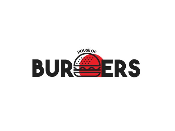
I chose the third logo, because of its clever combination of illustration and typography. The name is House of Burgers, I like how the actual burger replaces the G in "burgers". The noun Burgers consists of seven letters, therefore placing a Burger Illustration into the middle doesn’t only make the Logo look neat but also cool. I like how the bottom of the logo is neatly placed on one line, which contrast to the curved "House of".
The fourth Logo once again has a nice combination of typography and illustration, regardless of it not being about burgers. The "I" in "Guitar" has been replaced with an actual Guitar neck that is attached to the Guitar body, which is simultaneously shaped as an “S”. The white of the font, makes the logo look straight forward to the point and neat.
Finally, I choose the last one, because of its neat look. I like how it is nothing more than just a solid illustrator drawing. The black lines are quite thick, making the burger look very cartoonish and more suitable for a logo. I like how there is another black line at the top of the burgers left side, which however is curved. It gives a certain effect of the burger getting slightly shaken or being quite warm after getting freshly prepared. The burger realism also increased, thanks to certain detail, such as the cheese dripping or patties overlapping and having wavy drips.
I chose the second logo, due to its simplicity. I like how it only consists of a few illustrated objects, combined with a little text at the bottom. Yet what really makes it stand out for me are the two circles behind the burger. The yellow and blue shine quite aggressively, yet simultaneously mildly, as they were not displayed in front the actual burger. This makes the Logo look neat and clever.
I chose the third logo, because of its clever combination of illustration and typography. The name is House of Burgers, I like how the actual burger replaces the G in "burgers". The noun Burgers consists of seven letters, therefore placing a Burger Illustration into the middle doesn’t only make the Logo look neat but also cool. I like how the bottom of the logo is neatly placed on one line, which contrast to the curved "House of".
The fourth Logo once again has a nice combination of typography and illustration, regardless of it not being about burgers. The "I" in "Guitar" has been replaced with an actual Guitar neck that is attached to the Guitar body, which is simultaneously shaped as an “S”. The white of the font, makes the logo look straight forward to the point and neat.
Finally, I choose the last one, because of its neat look. I like how it is nothing more than just a solid illustrator drawing. The black lines are quite thick, making the burger look very cartoonish and more suitable for a logo. I like how there is another black line at the top of the burgers left side, which however is curved. It gives a certain effect of the burger getting slightly shaken or being quite warm after getting freshly prepared. The burger realism also increased, thanks to certain detail, such as the cheese dripping or patties overlapping and having wavy drips.
Logo Ideas
These are the Logo sketches I have made, for inspiration on how to design my final logo:

|

|

Ideas Combined
After combining my favourite ideas from my sketches, I have designed these four Logos as a base for the design of my final one.

Development of combined Ideas
|
I have chosen the elements I like the best from my combined ideas sketches and made a sketch of the general look I am going with for my logo.
Beneath that, I have also made some smaller sketches, which will help me when developing these digitally on adobe illustrator. These will also help when I design logo variations, later in my design process. I like these ideas, because of my combination of typography with illustrations. I am sure that these two combined will enable me to create a great burger logo. |
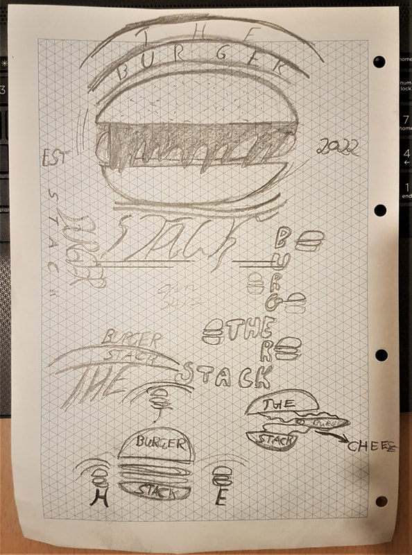
|
Digital Font Exploration
Found Logo Fonts
|
Exploring Logo Designs
|
Development of Ideas
|
These are the three essential steps for creating my actual final typography logo.
Firstly, I typed in the name "Burger Stack" in different font styles to have a genuine digital idea of how my typography logo could look like. I only used Black during this step to keep my ideas plain and basic, which is necessary for identifying suitability. I made sure to have fonts which look slightly fancier and fonts which look slightly more Bold and thicker in their appearances. This is so that these ideas will work as a true continuation from my initial ideas from my sketches. An example of such is the logo on the left in the fourth column.
I like this one, because of its bold style that has a lot of curviness to it. Therefore, combining this font, with the one on the right would keep the logo interesting, yet simple. One name, consisting of two words in distinctive styles, keeping the logo interesting and unique, when moving different parts and making some smaller or bigger changes for variation.
Secondly, that is what I choose to do when I was Exploring Logo Designs, in which I played around with font combinations, Letter Sizes and positioning. An example of that is the one in the middle of the second row. What I did here to Explore a Logo Design, is firstly that I wrote "Burger" and "Stack" in two different fonts, sizes and made sure to keep "Burger" in upper case and "Stack" in lower case. I place "Burger" above "Stack" and increased the space between each Letter of "Stack". I did this to create a sense of pleasure for the eye. Keeping both words close together and preventing visual repetition to make it fancy. To combine it with an Illustration, I would increase the space, between "Burger" and "Stack" and place a Burger in the middle of those two words. Since the top and bottom of a burger are (slightly) rounded, I would also use the Arc tool to make the words slightly rounded. This would make the typography match up with the illustrated Burger in a natural way. That is something similar I did for the logos on the left of the second row and for the logo in the middle of the third row. Placing a curved "The" on the upper curved side of B makes the "The" a lot more visually fluent than vocally. I only tried integrating "The" into some of those logo explorations. I liked this detail a lot and make sure to continue this when I start to develop upon my ideas.
Finally, I used a smaller Number of some Fonts that I used for my logo design exploration and created some actual Logos to create my final Logo Design. I also referred to my sketches during this Process, to make my digital Ideas even more accurate to my initial Ideas that I had at the start. I used a fancy font and made sure to keep the word with that font always larger than he other words in the Logo to make it stand out. This can be seen with the first final typo logo that I will use when combining it with the illustration.
Chosen Logo - Typohraphy
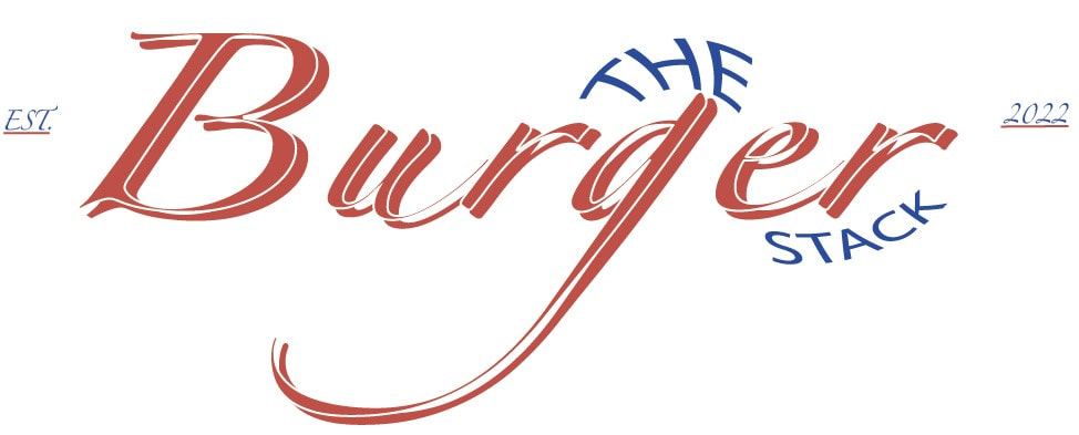
This is theTypography Logo that I will use when I combine it with my Burger Illustration.
sTypography Logo Variations
These are based on the Fonts I found in my Exploration Process and my SKethces.

|
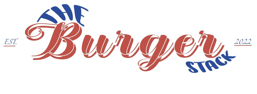
|
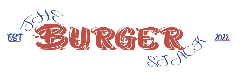
Finalisng Logo - Illustration
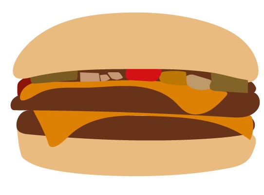
|

|

|

|

|

|
Final Logo Illustration
This is my final Logo Illustration that I will use when combining it with my Typography. However, I will move different parts of the actual Burger during the process of designing variations for the logo to correlate with my ideas and to try out different t looks. I will also change some parts if nmecessary.
- Make 3 more font variation ideas for the typo logo
- combine it with the Burger and make at least six different logos
Exploring Typography + Illustration
Menu Research
On the left is a link to a Pinterest board, which I have created. In it are Menu designs, which I like and would use for Inspirations for my own.
While creating this Board I made sure to consider these things;
While creating this Board I made sure to consider these things;
- To collect 10-15 Images that I like and do not have to be Burger / Juice themed
- To make sure that my research actually links to my Logo
- And to take a Screenshot of my Board with a link attached to it
Menu design Inspirations - Pinterest Board

"Link to my Board"
These are the Menu design Images that I have found and that relate to my own Personal taste.
Primary Research - Around Manchester
For this task, I was expected to go around Manchester and take Pictures of existing restaurants/fast food places/juice bars etc. that relate to my Project. I had to Photograph 4-5 different places and I was allowed to include Images of menus and packaging too. After that, I was to upload my images to Weebly.
These are the Images that I took:
These are the Images that I took:
Restaurant Logos/Exteriors
|
Menus- Physical & Digital
|
Leaflets
|
Window Advertisement
|
Creating Menus
In our class, we have been looking at a larger number of different menus, after which we had to start creating our own. My plan was to research a small variety of different ones and to use them then to design my Menus. I did this, by selecting a few from the Pinterest board I created and through searching some more up to put in as much variation as possible. After that, identified the colour schemes for each to take inspirations of my selected logos and to visualise how the colour will end up organized on my menus.
then write inspirations
then write inspirations
Menu design - 1

|
Adobe Colour + Personal A.C. additions + Eye drop additions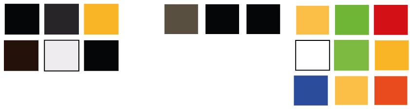
Fonts
|
Colour Schemes -
I have split the colour scheme into three, because not only have I used Adobe Colour to select certain colours within my inspiration menu, but I have also then added three more, which I think match up quite effectively with the six colours that I have already identified primarily. After that, I have used the eyedrop tool on certain Areas of the Menu and identified a few more colours. Some of them only vary from one another due to their softness and hue, such as the Orange/Beige tones.
I then obtained my first Colour pallet, by uploading the Image of the Menu unto Adobe Colour and then only selected the most essential Areas of Colour. It shows a mixture of dark and quite grim looking colours, with some bright ones within. The Black, Grey and dark brownish Tint add a sense of class and elegancy to the menu, which gets contrasted with the yellow and white appearances. These add a sense of creativity to the menus design, as their bright and attractive appearances contrast those of the darker colours.
The black used to draw the food and ingredient illustrations strongly contrast to the white background, making each item unique in their appearances and extremely eye catching to the viewer. The front side of the menu also has a certain type of detail, in the form of tiny dots and twirls, placed all over the page. This makes the front side appear very playful. The orange circle and brown used for the font also add a sense of warmth to the Logo. Also, the logos circle is not perfectly shaped, adding to the front pages theme of playfulness.
To add a few more colours to my Adobe Colour pallet, I have used the Zoom tool and identified a few more colours/variations. The Black and mahogany brown are still apparent, but I have also identified a small amount of Grey, which cannot immediately be seen without a closer look.
Finally, I have also used the eyedrop tool to identify some more hidden colours. I wanted to add to my range of specificality and was able to find some secondary colours, such as: Green and Orange. I also found some Tertiary Colour tint Variations for Beige. I like this third Colour Pallet a lot, due to its warmth and small yet effective variety of colours, but especially due to its range of tints.
Fonts -
By exploring fonts, I not only wanted to make my menu a near identical variation to the original one, but also make sure to use the fonts that I have used for my Typography Logo steps and some others that harmonize with the other ones in terms of accuracy. Therefore, I ended up using used; Zapfino and AcademyengravedLetPlain.
Menu Illustration Inspirations
Before I have started my actual Menu design Process, I first of all had to create a few more Illustrations, that I can use for the layout of my Menu. I wanted to do this to make the Menu appear a lot more lively and legit, as it is a lot more appropriate to see an actual or cartoonish like burger on a menu, when wanting to order a Burger. I have seen a large Number of Menus, both in and outside of my Menu Pin Wall, in which I have seen a lot of Illustarted menu items. Here re some examples.
(The add title and put in all illustartiosn. )
(The add title and put in all illustartiosn. )
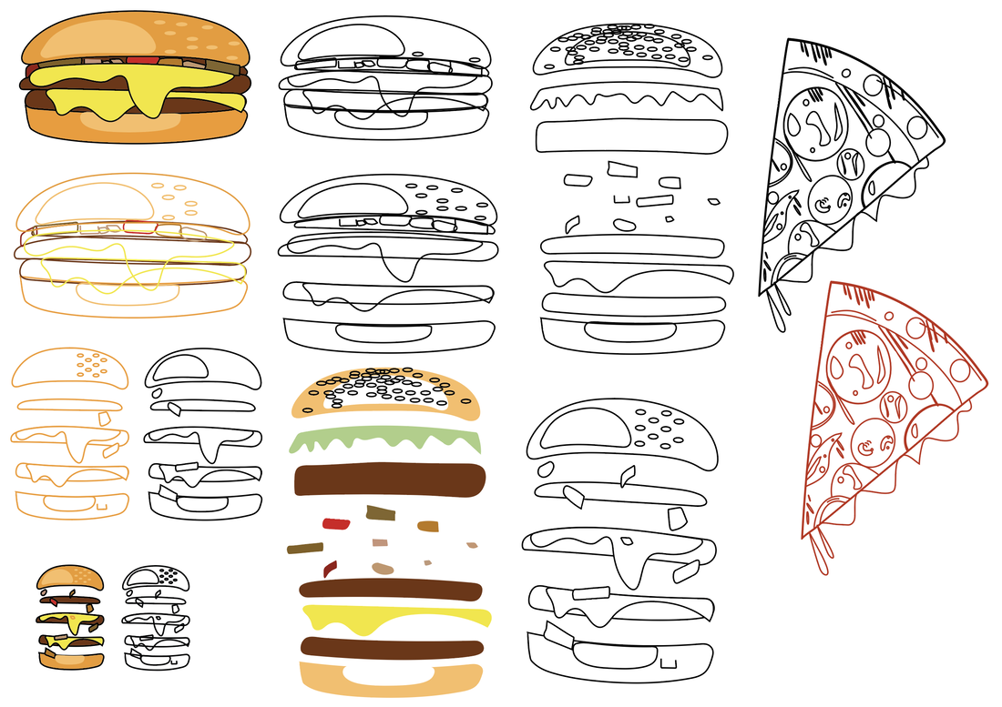
|
|
Menu - 1

|

|
“A designer knows he has achieved perfection not when there is nothing left to add, but when there is nothing left to take away.”
- – Antoine de Saint-Exupéry, author & poet.
